


I won’t insult you by compressing it down to the width of this column: click here for the full experience.
From the press release:
“The front cover of Harry Potter and the Deathly Hallows features a dramatic sky of oranges and golds. It depicts 17-year-old Harry with arm outstretched, reaching upward. The structures around Harry show evident destruction and in the shadows behind him, we see outlines of other people,” said David Saylor, Scholastic’s Art Director who has designed all seven Harry Potter covers and created the distinctive Harry Potter typeface.
“For the first time the cover is a wrap-around. On the back cover spidery hands are outstretched towards Harry. Only when the book is opened does one see a powerful image of He-Who-Must-Not-Be-Named, his glowing red eyes peering out from his hood.”
A few first impressions:
— Where’s the scar? Beneath that tousled forelock, presumably, but it’s usually more emphatic.
— I’ve always felt that “Deathly Hallows” suggested an Orpheus-style descent into the underworld, perhaps in search of the departed Dumbledore. This cover does nothing to change that — it could be an image of the underworld, with that livid orange sky, the murky watchers (at first I thought they were gravestones), the Colosseum-like structure. (A quote from the second Bill & Ted sprang to mind, when they first see Hell: “We were totally lied to by album covers!”
— No wands. Are they going mano-a-mano? Or will Harry learn more about wandless spellcasting techniques?
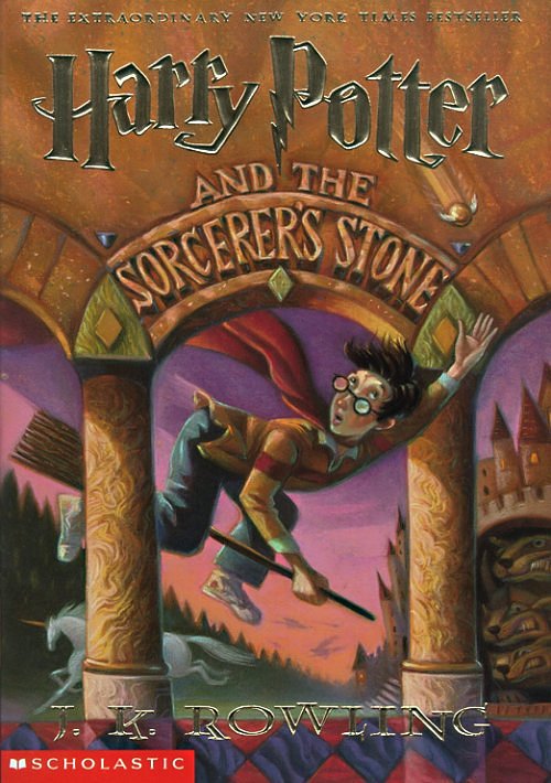
— Click back for a second to the cover art from the first book. Amazing how much Harry’s grown up. And has he grown more subtly Radcliffean? I think he has.
— It doesn’t take a Richard Lacayo to notice that Harry and the Noseless One are echoing each other with their poses. They’re antagonists, but there’s an afffinity there, too.
— What’s with the drapery? Are those the curtains, closing on Harry’s final act?
Update: links to the UK versions are here.
Second update: if you want to be lead gently, firmly and charmingly, and with forensic thoroughness, through the cover art for the various editions, give a listen to the Leaky Cauldron Pottercast #83. Melissa Anelli and Sue Upton, they speak some fluent Potter over there. The UK art — the kids’ version, anyway — is much more detailed and rich in clues and symbols than the US version (it’s much more hideous, too — looks like a Mad magazine parody), and you really need them to break it down properly.