What would it take to make Microsoft relevant in a world filled with iOS 4, Android and webOS? Consider, for a moment, that the aforementioned platforms are the Blue Screen of Death for Microsoft. The last generation Windows Mobile platform was old, busted and rusted. And like any overpaid IT guy will ask you, “Have you tried rebooting?” Well, isn’t that a clever idea?
When Microsoft unveiled the Windows Phone 7 platform earlier this year at Mobile World Congress, it caught the attention of the entire industry because it simply didn’t look like a Microsoft product. I was first privy to a demo of the OS weeks prior to its official unveiling and I remarked that it didn’t really look like a Microsoft product. It was different.
I’ve had my hands on a “close-to-release candidate” of the completely overhauled platform running aboard a Samsung dev sled for a few days. My earlier suspicions about the mobile OS are more or less correct; it’s different and quite nice. Over the years Microsoft has built a number of successful individual products (Bing, Xbox Live, Zune). You could say that Windows Phone 7 is a lot like Voltron. (Yeah, I went there.) The individual pieces are cool in and of themselves but when combined it morphs into a kick-ass sword-wielding robot that’s ready to slay the beast.
So how is it?
Well, there are a few caveats, which is why this isn’t a review of the mobile platform. The Apps Marketplace is a barren wasteland except for a few demo apps. Developers will be getting dev sleds shortly ensuring they have enough time before the fall rollout to fill the Marketplace with goodies. The Xbox Live hub is also under construction. We can’t comment on battery life or hardware specs because “Taylor” the dev sled we’re using will never make it to market and Microsoft is still tweaking its battery optimization algorithms. With that out of the way, let’s get started.
User Interface
Unlike everyone else in the industry, Microsoft made the concerted effort not to follow Apple’s design layout of individual application icons. The Windows Phone 7 layout is more akin to a web page filled with “hubs” that act as aggregators for content. For instance, the Pictures hub pulls in photos from the device, Facebook, Windows Live and whatever has been synced with your PC over Wi-Fi. It’s clever and the most compelling thing about the operating system. It simply works and doesn’t require you to jump from one app to another just to see your photos.
[youtube=http://www.youtube.com/watch?v=MdDAeyy1H0A]
The tiles on the start page are dynamic, so the gmail tile gives me a visual representation of how many unread emails I have. The People hub, for instance, filters through the latest profile pictures of my friends from Facebook. If I used Windows Live or had friends who used it, I’d probably see content filter in.
Swiping from right to left pulls up a list of applications. It can be rather lengthy depending on the number of apps you have but Microsoft says certain apps like games will all be compiled under the Games hub rather than having individual shortcuts in list view.
Search is integrated throughout the device and because of the way Microsoft has structured the layout of WP7, you could end up flicking up and down for quite a while. Every WP7 phone will have three buttons on the front of the device: Back, Start and Search. The Back button does what you’d expect – taking you back a page. The Start button takes you back to the start page from wherever you are. Search is contextual so depending on where you’re searching, results may vary. In People, it will search your list of contacts, while Bing loads from the start screen.
Notifications are unobtrusive and pop up at the top of the screen where you can act on them if you choose to or ignore them. But unlike webOS, notifications on WP7 disappear, which can be viewed as a blessing or curse and where the live tiles take over. This is how notifications should work.
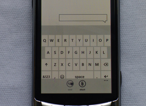
The touch keyboard looks cramped and crappy but it works surprisingly well and it’s fast. And the more you use it, the more it learns about your vocabulary. Tapping on any given word will highlight the whole thing and long pressing allows you to drop the cursor wherever you want.
There’s no proper menu button on Windows Phone 7 devices but there is a menu bar that resides at the bottom of the screen of most apps or programs. The tiny icons are unlabeled but intuitive. A set of ellipses can be tapped or dragged up to reveal labels for said icons and other menu-y things. It’s constant throughout the OS. However, you will run into circumstances where a long press is needed but there’s no telling where and when you may encounter it.
I’m impressed with Windows Phone 7 and while the build I’m currently using is nowhere near final, it works and is more than impressive. Micosoft managed to build a clean and fluid interface that doesn’t require you to dive into sub-menu after sub-menu to turn on Wi-Fi, for example. It’s not fancy and it doesn’t have to be. It simply works but I have to wonder whether or not Microsoft will be proactive about iterating and trimming the fat going forward.


