If you’re grumbling your way through a mountain of tax forms at the last minute today (or if you forgot today was tax day—hurry!), you may be wondering where all your hard-earned money is going.
Google wondered the same thing, and sought to answer that question with what it calls the Data Viz Challenge. Per a company blog post:
“The challenge was a five-week competition that asked developers to visualize how our federal income tax dollars are spent. We received more than 40 thought-provoking entries that each take a unique approach to making this data more accessible to taxpayers.”
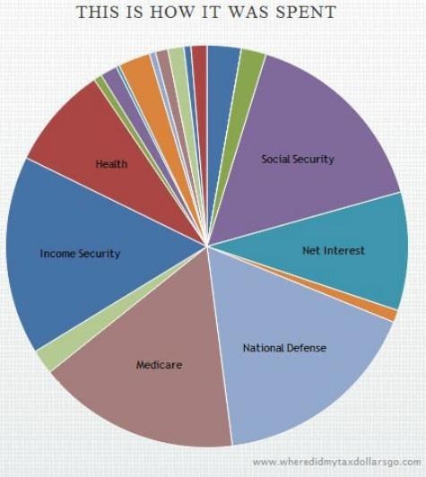
The winning entry is an interactive pie chart-style website fittingly called Where Did My Tax Dollars Go? wherein you enter your income and filing status to see how your taxes get divvied up.
According to the site, a single person making $50,000 pays $11,088 in taxes. Of that, $7,263 goes to federal taxes, $3,100 to social security taxes, and $725 to Medicare taxes. The site shows that after social security and Medicare, much of the remaining tax dollars go towards national defense, net interest, income security and health. So there you have it.

You can check out the other finalists at DataVizChallenge.org or catch some quick previews in the above video.
More on TIME.com:

