Make no mistake about it: The Bold 9900 is the best BlackBerry smartphone to date. But even with a handsome redesign highlighted by a new capacitive touchscreen (plus all the familiar features that make a BlackBerry a Blackberry) will it be enough to close the gap between Apple or Android? Maybe a little?
Take my hand. Let’s find out.
(MORE: T-Mobile’s 4G BlackBerry Bold Costs a Cool $300)
The Outside
On the surface it’s beautifully designed with a surprising amount of professional-grade heft. Unlike the flimsy Curve (or even previous versions of the Bold before it) it doesn’t feel like a toy, thanks in no small part to the rubbery, carbon-fiber backing joined by a metal rim that eases roundedly into the bezel.
Smooth, curved edges make it especially comfortable to grip, while the hallmark physical keyboard that BlackBerry fanatics swear by is as good as ever. Actually, scratch that: It’s one of the best physical keyboards I’ve ever used on a smartphone (including sliders like the Droid line). The buttons are large and well-separated, with a discernible amount of pressure on push-back. That affirmative *click* you get with each button press? Very satisfying.
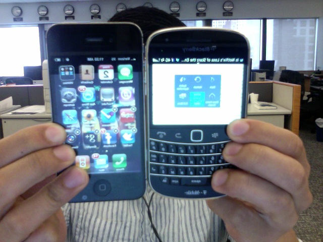
Here’s a size comparison with the iPhone 4:
As you can see, the 9900 is a bit shorter, but also a few millimeters wider and just a hair thicker. It feels significantly lighter, too, at just 4.5 ounces.
The LCD touchscreen is brightly-lit and responsive with BlackBerry’s highest resolution yet at 480 x 640 pixels. You can fly through menus, pictures or whatever else you’re flicking through with all the familiar pinch-to-zoom and sideways scrolling functionality native to most current touchscreen phones.
(MORE: New BlackBerry Curves Are Probably Not for You)
But that isn’t to say that the touchscreen here is completely intuitive: The Bold still has a trackpad for your thumb, which does little but eat into the touchscreen’s real estate. And with a display of only 2.8-inches, it feels like space wasted.
I’m sure the design team had their reasons for doing this (training wheels, perhaps?), but the inclusion of the trackpad not only feels redundant, it’s downright confusing. I found myself often hesitating between using the touchscreen or the trackpad to navigate, sometimes switching between the two awkwardly.
Don’t get me wrong: I’m not against learning new behaviors, but here it would make a lot more sense if it was just a touchscreen. When you’re using a phone you want it to feel like second nature: The best smartphones blend into your hand and become an extension of you.
Here, with both a touchscreen and a trackpad, that isn’t the case at all.
(…review continues on next page…)


