Bill Gates, surrounded by boxes with a now-ancient Microsoft logo in 1986
My colleague Matt Peckham already wrote about Microsoft’s new logo, which the company unveiled today. Its defining attribute is that it’s extremely consistent with the “Modern UI” (formerly known as Metro) which is rolling out across so many products, most notably including Windows 8. It’s the first new Microsoft logo since 1987, and seeing it made me want to revisit all the old ones.
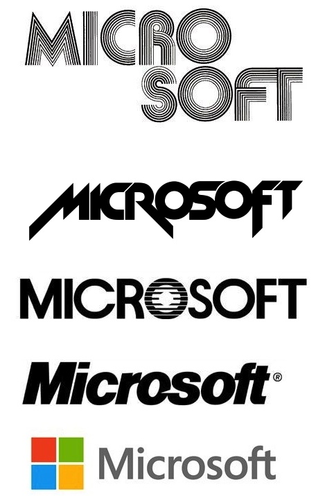
Fortunately, Todd Bishop of GeekWire included them in his post on the new one. Here they are, starting with the 1976 model and moving on to the present day:
A few thoughts:
* The first two logos, while inelegant and silly, are wonderfully evocative of their eras — the 1970s and early 1980s, respectively. The first one looks like it was done with rub-on lettering; the second one is my favorite Microsoft logo of all time, hands down, perhaps because it reminds me of using computers in high school in 1980.
* The third one, from later in the 1980s, hasn’t aged well. Actually, it makes my eyeballs hurt.
* The fourth one — the 1987 version — has aged well. It’s not the Coca-Cola logo or the GE logo, but if the folks who designed it intended to come up with something that would still feel relevant a decade or two into the future, they succeeded. That said, I doubt if there’s a person on earth, possibly including the folks in Redmond, with all that much emotional attachment to it.
* I’m not immediately warming to the new design, although I realize that unfamiliar logos are often jarring. I understand what the company is trying to accomplish. In fact, the company has been so relentlessly consistent in its recent interface and branding decisions that it would have been astounding if this logo wasn’t…well, this logo.
Here’s why I’m not an insta-fan: With operating systems, you want the interface to recede into the background. Too much personality is dangerous; neutrality is great. One of the best things about the “Modern UI” is that it’s simple and unaffected and, basically, easy to ignore while you go about doing whatever you’re trying to do with Windows.
Logos are different. Their personality helps tell you what the company thinks about itself. A little idiosyncrasy helps, and uniformity and neutrality can feel sterile. The new logo — which I realize is virtually identical, style-wise, to the new Windows logo I think is okay — doesn’t tell me enough about Microsoft’s vision of Microsoft.
But: I do like the colored logo blocks which reference the traditional Windows colors. Here’s what they say to me: “We’re Microsoft. We do Windows. We intend to do Windows, in one form or another, for a long time to come.” That is a specific statement.
And maybe Microsoft’s vision of itself is that it’s a company that recedes into the background and doesn’t demand much of your attention — which, come to think about it, is not a bad vision at all.
One final question: What are the chances this logo — and the whole “Modern UI” aesthetic — will be around in 2037?


