


Facebook users have a long history of flipping out over the site’s numerous redesigns. While I fully expect this to happen again as Facebook rolls out its upcoming News Feed overhaul, the changes actually seem welcome.
The redesigned News Feed is simpler, cleaner and designed to be consistent across desktop and mobile devices. Here are a few reasons why that’s a good thing:
The Current News Feed Is a Godawful Mess
Just step back and look at the News Feed today and admire what a terrible wall of text it has become. Seriously, who thought the four-column layout with two separate feeds — a main column for major news, and a smaller news ticker for the network’s excruciating minutiae — was a good idea? There’s so much clutter on the screen that it’s hard to find the types of information you’re actually looking for.
With the redesign, Facebook has condensed its two feeds into one, with an easy-to-spot filter on the right side for viewing certain types of updates (more on that shortly). The chat frame has been condensed into the left sidebar, which is now just a strip of icons, so there’s less text on the screen overall. In total, the page is back down to three columns — one of them being quite narrow — and all the action happens at the center of the screen, as it should.
Things You Don’t Care About Should Be Easier to Ignore (and Vice Versa)
A key feature in the redesign is a feed selector, which lets you focus on specific types of news. The “News Feed” filter is the regular assortment of updates, sorted by algorithm in order of importance, while the “Most Recent” filter shows everything in reverse chronological order. There are also specialized feeds for Photos, Music, Games, Groups and more.
The use of filters is basically an acknowledgement that the old ticker on the right side of the screen didn’t work. It was just an unwieldy mass of random likes, comments, game activity and shared Spotify songs, with no easy to way to hide undesired information. It wasn’t very easy to scan either, because you had to click or hover over each item just to see what people were talking about. I’m glad it’s gone. The redesigned News Feed should help people browse through the same information faster and more efficiently.
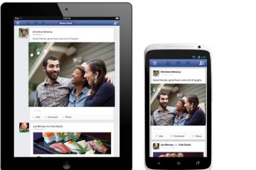
Bigger Photos Means Less Clicking
Photos will be a lot larger in the redesigned News Feed, which makes sense, because Facebook says over 50 percent of the content found there is visual. I like the idea of bigger photos for the same reason I like Instagram’s new web feed: It’ll be easier to just scroll through, without having to click on every individual image to see what’s going on.
Not everything’s going to be peachy about the redesign. For one thing, bigger photos means bigger and therefore more intrusive advertisements — a fact that Facebook has readily admitted. Also, the new design appears to bury the account settings and recently-added privacy shortcuts that resided in plain view along the top menu bar.
The good news is that Facebook seems willing to tweak things as it rolls out the News Feed redesign and collects feedback. For now, only a small number of users will see it, though you can sign up for the waitlist to start using it sooner. And you know what? Early access shouldn’t be so repulsive this time.