Design majors, fashion bloggers and connoisseurs of artfully applied nudity rejoice! Yesterday, Tumblr announced in a series of blog posts that it was giving a facelift to its iPhone and iPad experiences, making it easier for users to tumble things on the fly.
(MORE: Tumblr Goes Offline and Other Technology PR Fails)

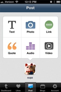
The iPhone app was reinvented in the form of Tumblr 2.0, which is available as a free download in the App Store. The previously vertical posting options are handsomely reconfigured as what you see to the left — it’s less clunky and more intuitive, which lends itself nicely to Tumblr’s whole “ease over everything” mantra.
The Dashboard itself appears more or less the same, though it now requires fewer swipes to add in things like tags or original sources. And new users are also able to activate a new Tumblr account from within the app without having to go through the actual Tumblr website.
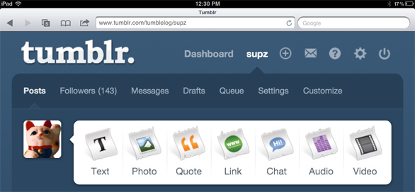
As for the iPad, it features a newly optimized Web view with larger photos that takes advantage of the tablet’s screen real estate. Thus, all of the links are better separated and are easier to click through with your fingers.

They’re nice upgrades and go hand in hand with making the whole Tumblr experience easier for users. A few minor gripes, though: The icons in the upper-right hand corner of the Web and iPad Dashboards aren’t readily obvious as to what they do unless you click on them. Also (and I don’t mean to turn this thing into a laundry list of wishful thinking) but a NSFW flagging feature or some other mechanism would be helpful, too.
But all in all, the new redesigns are really nice additives and certainly help justify Tumblr passing WordPress as the internet’s preeminent blogging platform, with close to 21 million accounts activated. Good job, guys.
MORE: Blogger Regains its Cool

