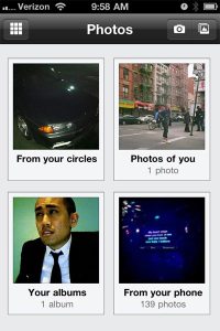
 A Lovely, Glitchy Photo Menu
Navigating photos is a lovely experience, at least at first glance. However, when you start actually using it you come across a few hiccups that hold it back from being a 100% pleasant experience. The first photo screen is sorted into big Polaroid-shaped thumbnails categorized in ways you’d actually use: 1. From your Circles, 2. Photos of you, 3. Your albums, and 4. Photos from your phone.
However, after you click on a picture’s thumbnail, it takes you to another promising subset that divides your photos into even smaller Polaroids.
Where things get a bit sticky, though, is when you try to select photos from your phone to upload: Whereas you typically click on a photo to be taken to a larger version of it, when you click on one here it takes you back to the main menu screen. In order to select the photo you want to upload, you have to check off a tiny, non-obvious circle underneath the photo. I have pretty skinny (and some would say awkwardly feminine?) fingers, but even for me it was difficult to check the circle I actually wanted. I understand that Google wants you to be able to upload multiple photos at a time, but I honestly feel that this experience can be made much, much better.
That Profile Thing
Profiles are as standard as they come, although you can’t make any edits on the go (i.e. basic info, or current employer, etc.) Could be annoying to some people keen on tinkering, but it’s a pretty big “meh” overall.
article continues on next page…

