I can’t shake the sense that the new gradient, sky-blue icon for Twitter version 3.0 (for Mac), nestled down there in my chockablock OS X dock between Skype and HipChat, isn’t quite symmetric. If you just upgraded, stare at the thing for a few moments and tell me it doesn’t look like they made the right side a few pixels higher — maybe because of the trajectory of that freaky eyeless chirping bird? I don’t know. I took a screenshot and threw it in Pixelmator just to be sure, and yep, square as a square. Maybe I need my eyes checked.
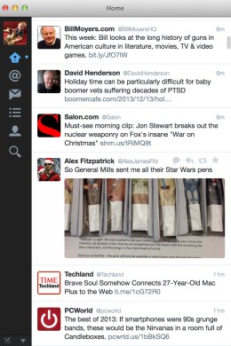
That aside, I’m chuffed (love that goofy word) about what’s changed here. There’s the revamped main window itself, now a touch bigger font-wise and cleaner looking to my eyes. The icons at left are a trifle larger and brighter, and the home icon that previously resembled a dialogue balloon now looks like an actual house (clarity!), while the direct message button that previously resembled a folded envelope now looks like a franken-envelope-dialogue-balloon (weird!). The remainder look about the same; the Favorites star icon, which used to sit along the left side, is now under your profile, summoned via the “dot-dot-dot” button, where you’ll find it perched above Mentions and Lists and Custom Timelines.
The biggest change: inline picture displays, which Twitter enables by default. You can turn it off in settings (just uncheck “image previews”) if you’d rather click short links, but I’m digging it, even if it requires more scrolling, since the pictures occupy the space of roughly two stacked tweets. The less I have to summon sub-windows in a timeline-oriented app like Twitter, the better — you can still click the pictures here to blow them up, full-size, but they’re already decent-sized in the preview.
I’m also digging the new detail format for each tweet, which manages to pack in favorite and reweet counts (alongside profile shots of RT’ers lined up in a row — you see more or fewer depending on how wide you’ve made the app) without it feeling over-busy or confusing. You can also now interact with all of someone’s profile information in the app itself. Before, if you clicked on someone’s follower or follow list, you were kicked over to a browser, where you’d have to redundantly log into the service; now, those lists are displayed inline to the app.
You could almost say there’s a Facebook Newsfeed vibe to this new flow. Nothing wrong with that of course. It gives the app a leg up, in my view, if you’re managing a single account and don’t care about simultaneous stream-viewing. I quit TweetDeck after Twitter added Retina support (I have a Retina MacBook Pro), mostly because I prefer this sort of app to live in — and notify me through — my menubar. This new update makes me even happier about that decision.

