Apparently, some people are excited about seeing logos for the Thor and The First Avenger: Captain America movies. Me, I don’t get it. Not because I don’t understand the thrill of seeing something official from these much-anticipated movies, even if it’s just logo artwork, thereby increasing anticipation for anything of real interest and/or excitement, but because these are some really shitty logos.
Look, here’s the one for Thor:
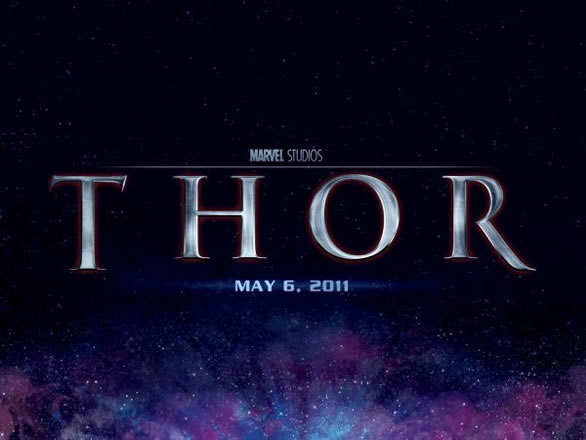
It’s kind of dull, isn’t it? It says nothing other than “I have a copy of Photoshop.” What’s weird is, Thor already has a couple of great logos from the comic itself:
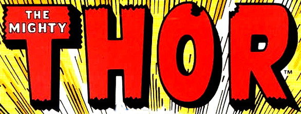
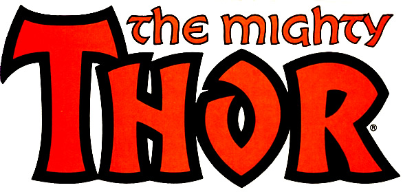
Both of these logos have more energy and impact and “Hey, I’m action-packed and exciting” than the official movie logo (and the second also has some stylized take on ancient type going for it, as well). Sure, I can buy that the first may be too “comic-booky” for today’s sophisticated moviegoing audience, but really, that second isn’t good enough?
I don’t know why I’m surprised, really; I should be used to moviemakers throwing away perfectly good logos in favor of bad ones. I mean, look at these:
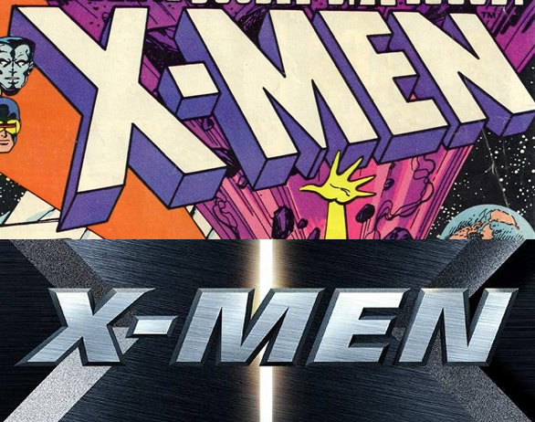
 What is going on? Why can’t the movie industry recognize good logo design when it’s in front of them, and instead opt for generic type that ignores the nostalgia potential that’s just staring them in the face? And it really is nostalgia value: The Green Lantern movie logo may essentially be the same as the current comic logo, but really, which one would you rather have? This one:

Or this one?
I think the choice is clear. Come on, Hollywood. Get with the program.

